
Tulsi is a mobile app that simplifies the process of choosing herbal teas to support holistic wellness.
-
Timeline
3x 2 Week Sprints
-
Role
UX Research & Design
-
Deliverables
User Surveys, Personas, & Journeys
Wireframes, Prototypes, Testing
Visual Design & UX Writing
The Problem:
Tulsi App grew out of my experience working with the Gaia School of Healing. Through informal conversations with Gen Z and Millenial aspiring herbalists and wellness enthusiasts, I identified a hole in the market for digital herbalism tools.
According to a study from UK-based analyst house, Juniper Research, “the number of people using digital therapeutics and wellness apps will grow from 627 million in 2020 to more than 1.4 billion in 2025.” Amongst the thousands of wellness apps for things like meditation and fitness, there is an absence of digital tools that make herbalism content easy to understand and accessible to everyone.

The Approach
I explored my initial hypothesis by recruiting participants from online wellness groups to conduct 30-minute semi-structured interviews. My goal was to better understand what users might want and need in a digital product by actively listening and observing how they use existing tools.
Discovery:
User interviews: 6 participants ages 22-39 from online wellness communities, who expressed interest in herbalism. Observations with existing digital tools provided the foundation for further inquiry.
User survey: 14 additional participants from wellness groups completed an email survey. Questions included multiple choice based on initial interview findings and open-ended options to allow for new insights.


Research Findings:
15/20 participants have used/ currently use a mobile app to learn about herbalism. The most popular app is Instagram.
All participants who use Instagram enjoy the multitude of experiences with herbalism shared on this app. However, it does not satisfy their needs for personally relevant content and can be distracting because they use this app for a variety of other content.
13/14 wellness enthusiasts surveyed and all 6 interview participants seek out teas to feel calmer.
Other motivations include nutrition, ritual, digestion, hormone balance, expert advice, visits to a store/supplier, medical studies, peer experience, caffeine intake, flavor, and change in season.
Affinity Maps:
I mapped out user needs and behaviors as well as strengths and weaknesses of existing digital tools to illustrate the gap that I could fill with the introduction of a new app.
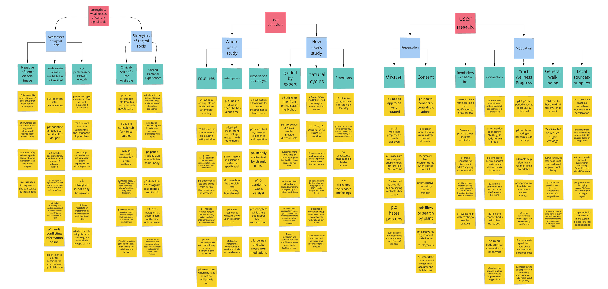
Synthesis:
Current digital tools did not fulfill users’ needs and wants. The most popular topics amongst users are:
personalized suggestions
simplified tea profiles
expert advice
connection to natural cycles
shared experiences/ community
sustainable/local sources
glossary of terms
tracking (that is not pressured)

User Personas:
I developed a set of personas based on the goals and behaviors I observed during my interviews. Returning to these personas throughout my process helped me maintain my focus on the end-user and mitigate any bias related to my interest in the subject matter.


Brainstorm:
I did some quick sketches, using a crazy-8 structure, spending 1 minute each on 8 sketches for app concepts. I proceeded to jot some other ideas on post-it notes once I got my ideas flowing.
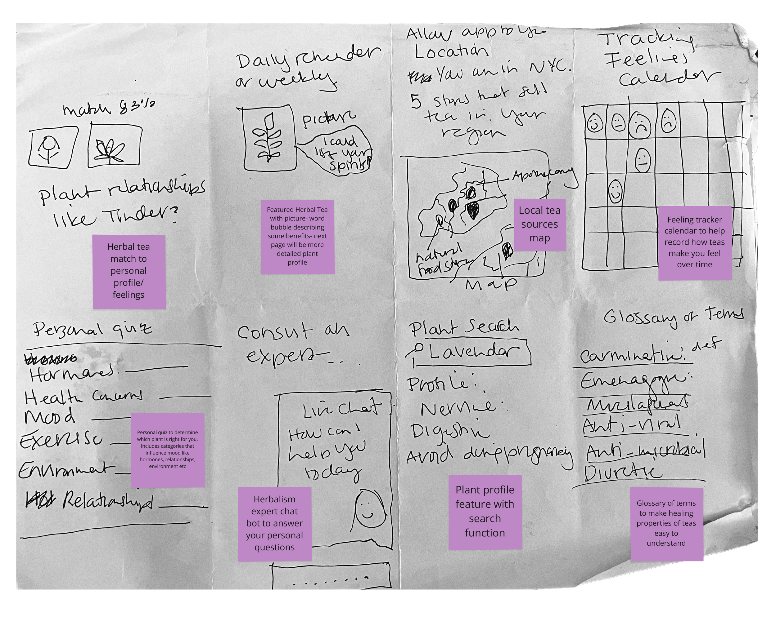
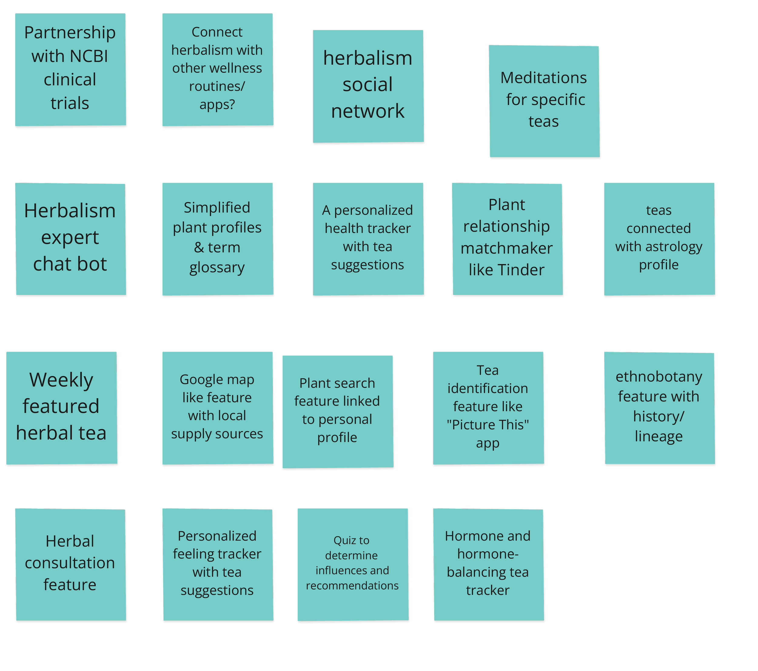
Complexity/Value:
To cull down which ideas to pursue, I analyzed the projected value and resources required for each concept.

Based on resources and value, I decided to move forward with:
a quiz to determine tea suggestions
simplified tea plant profiles
a weekly featured tea
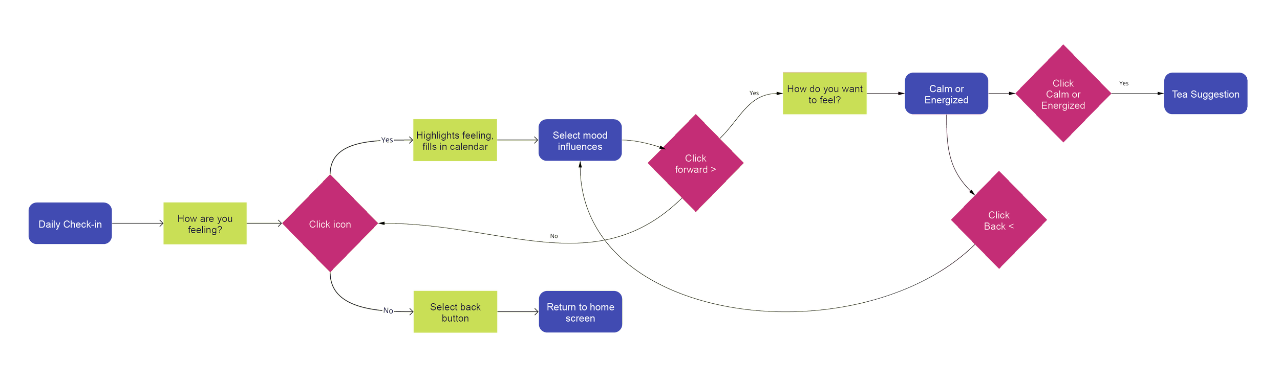
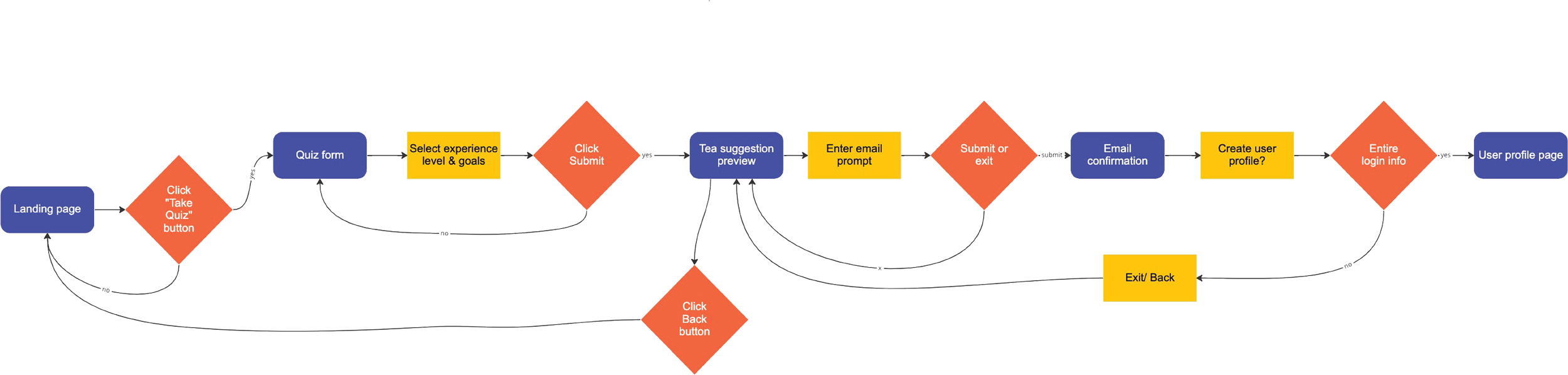
Mapping the User Journey:
Creating user flows helped me determine which screens to design. With my user personas and research in mind, the goal of my initial flows was to collect just enough data to create personalized tea suggestions.
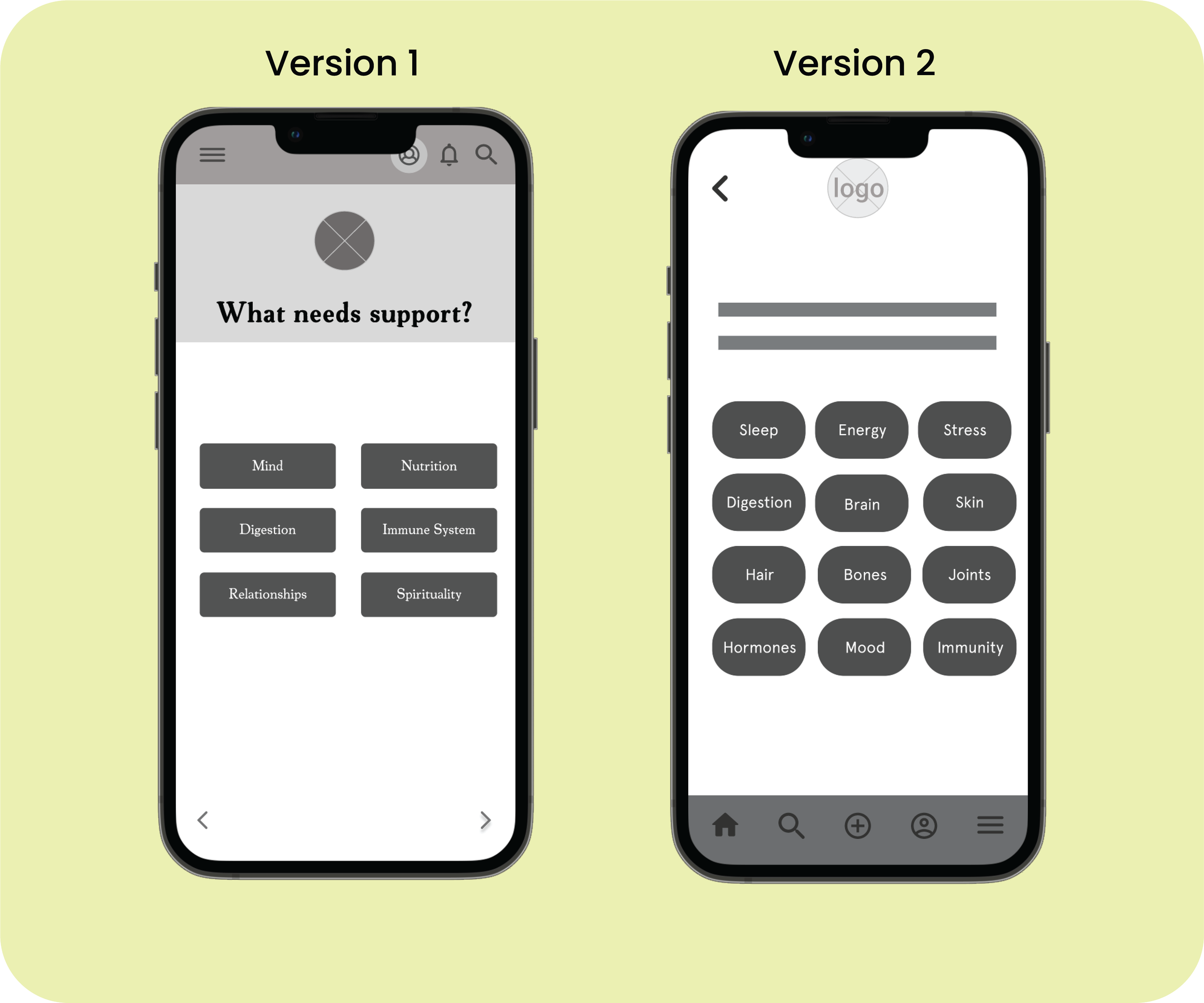
Wireframing:
I did several versions of wireframes, gathering feedback to make adjustments before proceeding to high-fidelity prototypes. This was crucial to my process of determining which copy to use and how to arrange it on the interface. I cross-referenced intake forms from clinical herbalists, noting that the choice of words was important in establishing user trust.
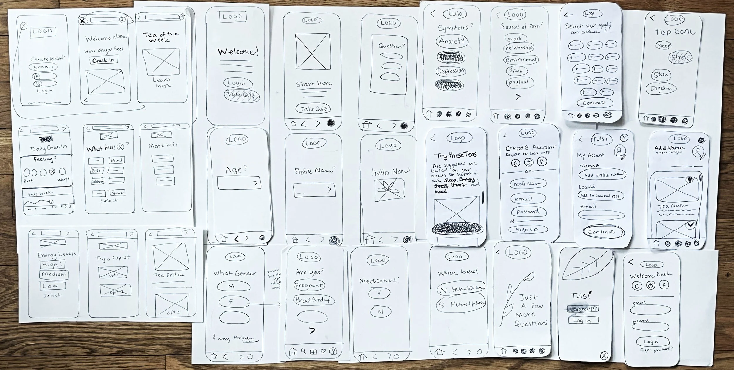
Early Testing:
After gathering feedback from 5 novice users, I realized my initial flow assumed a baseline understanding of other wellness apps that was too confusing for new users. Taking this feedback into consideration, I made my 2nd iteration less feature-focused and mapped out how the questions will lead to the creation of a user profile.
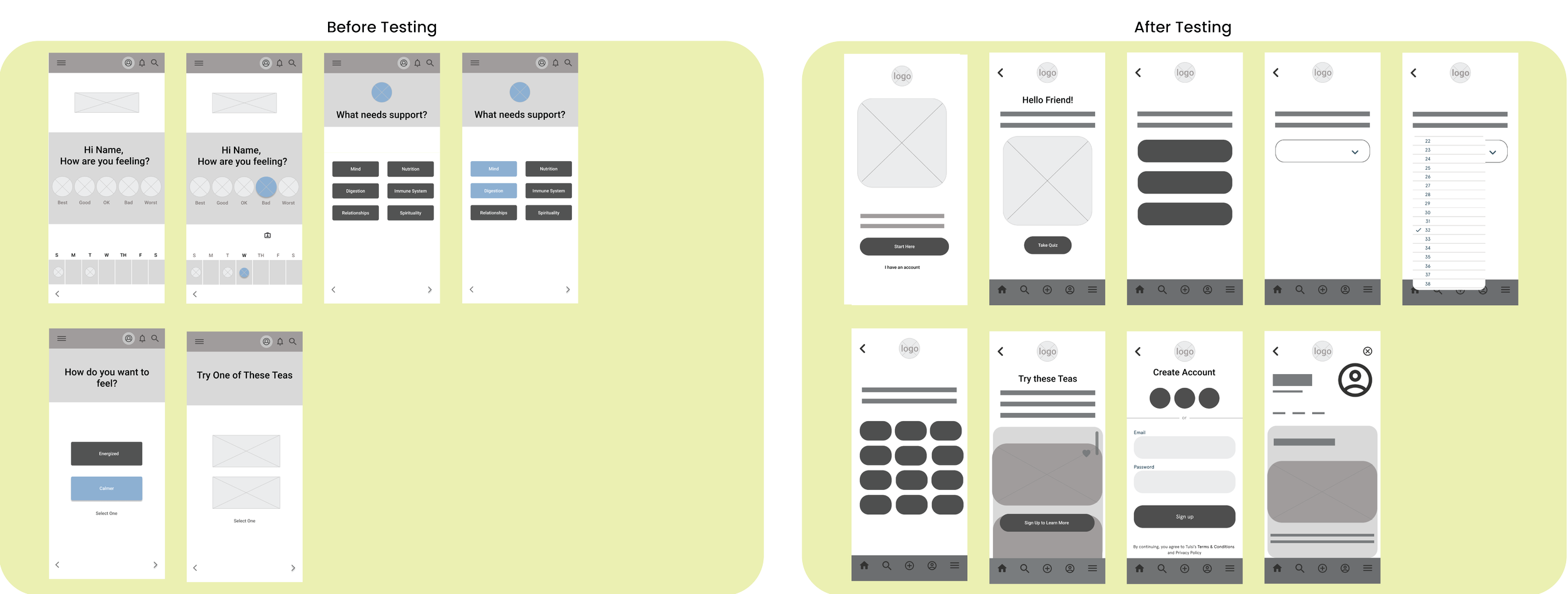
Testing Takeaways:
More information is needed for task to feel complete
Add more copy from clinical intake forms
Copy is key in building user trust
Change typeface to san serif to improve accessibility
Move menu bar to bottom for easier use

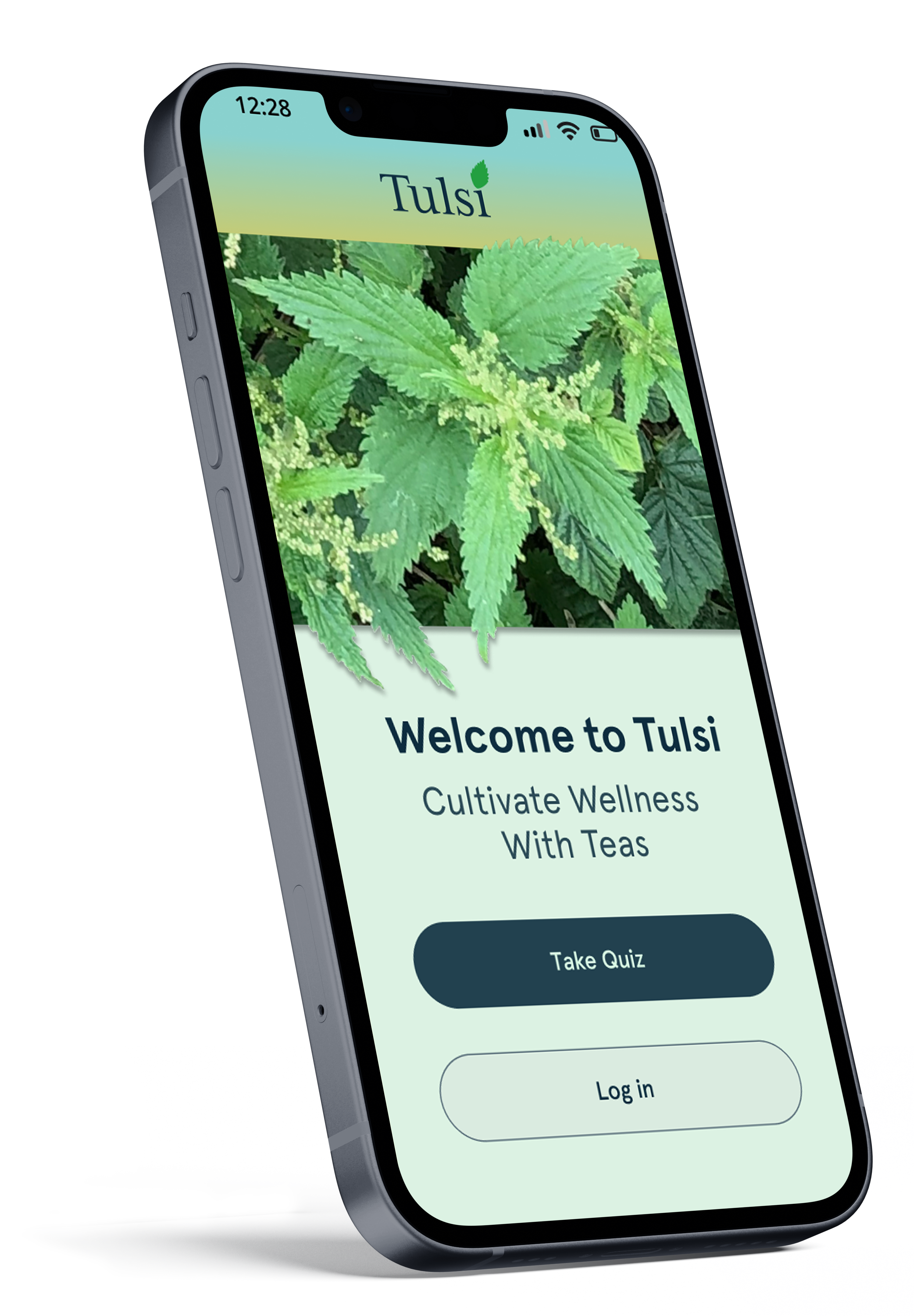
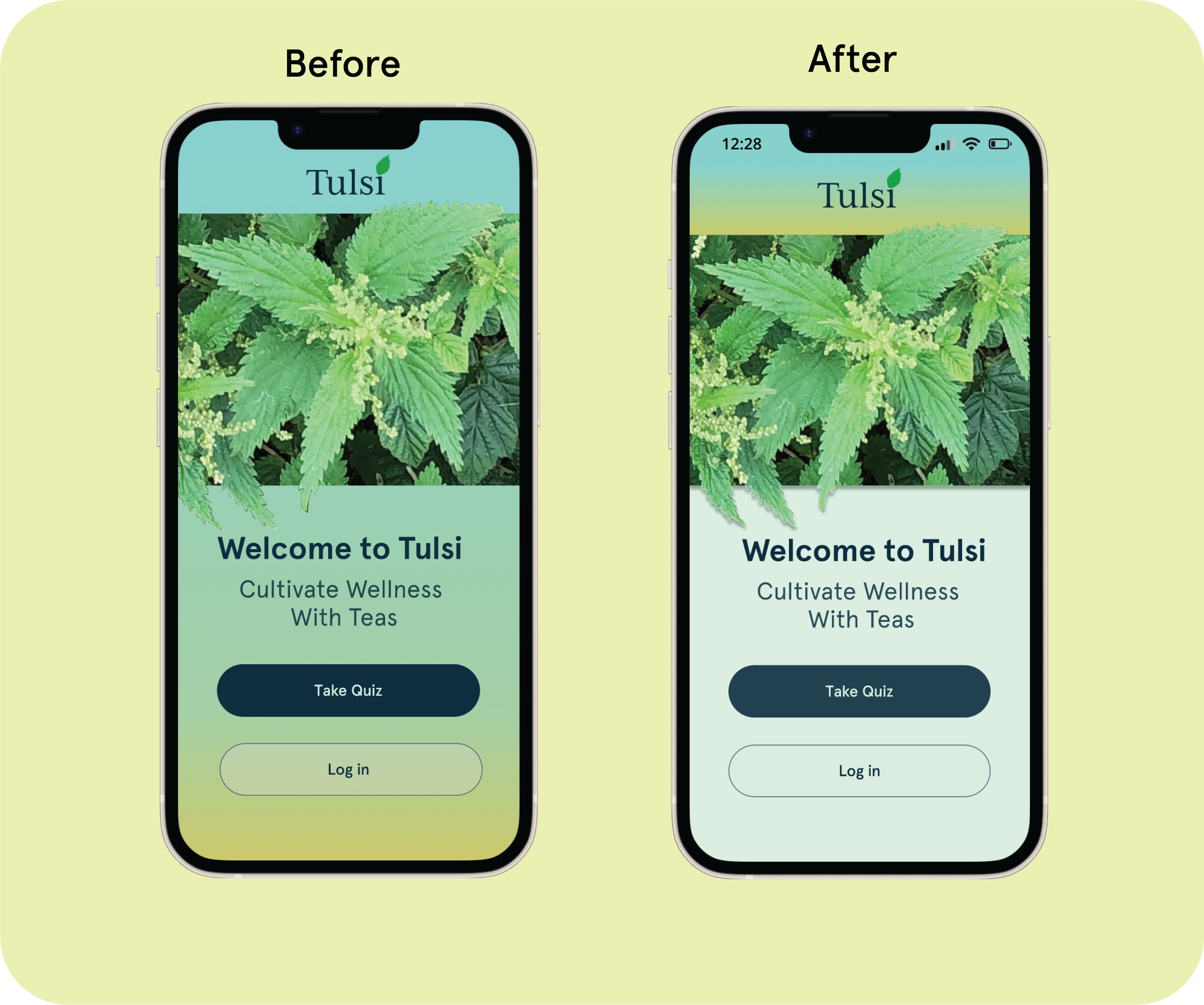
Visual Design:
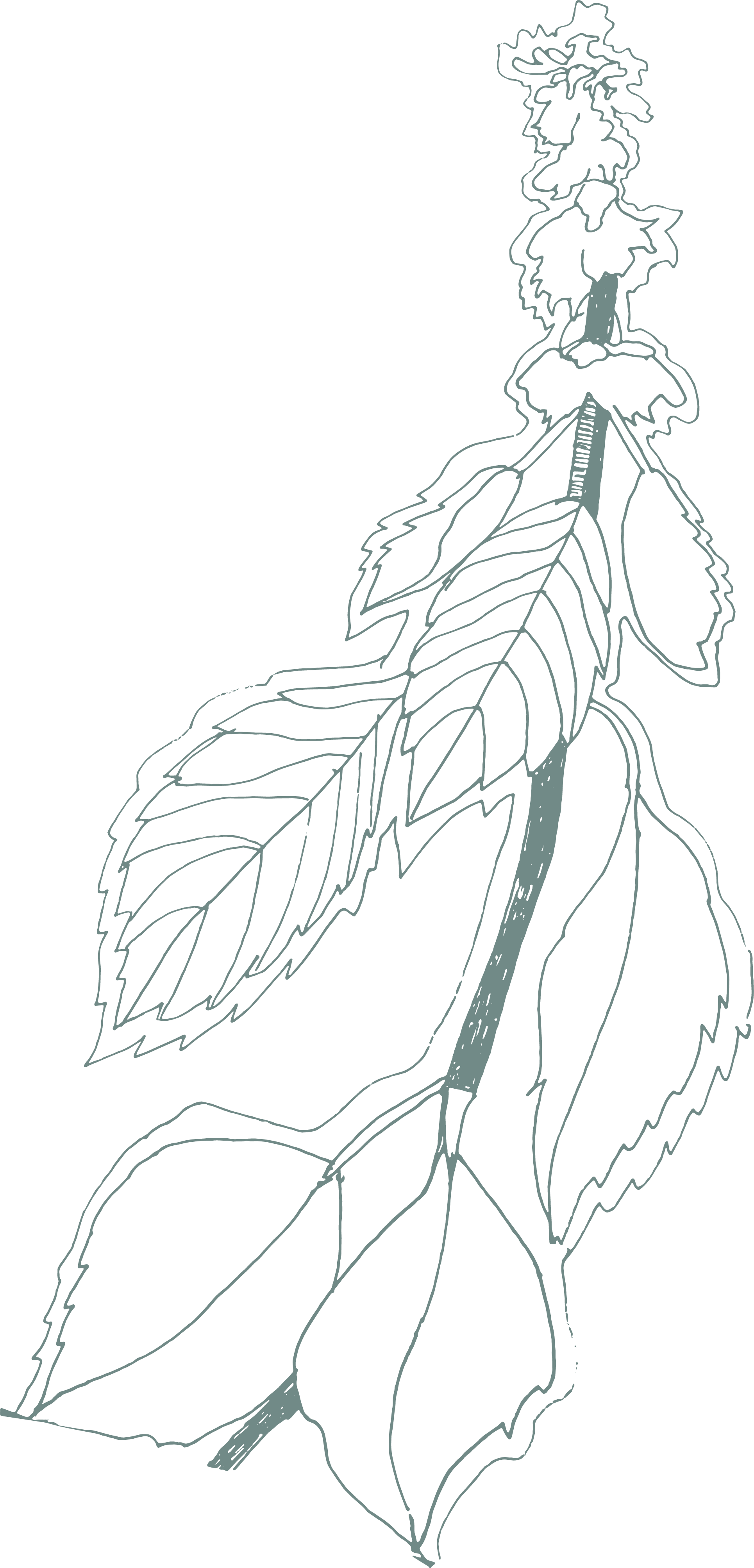
The interface aims to be clean, clear, and a bit playful. I chose an analogous color palette with calming blues and pops of energetic greens. I hand-drew leaves from the medicinal Tulsi plant to accent the serif font in the logo. I included drawings and photographic cut-outs as playful elements to contrast the straightforward copy.
Accessibility:
Taking into account users with visual impairments, I replaced the initial background gradient with a solid light neutral. I measured my color contrast in the typeface and buttons to ensure finalized iterations meet the WCAG standards.
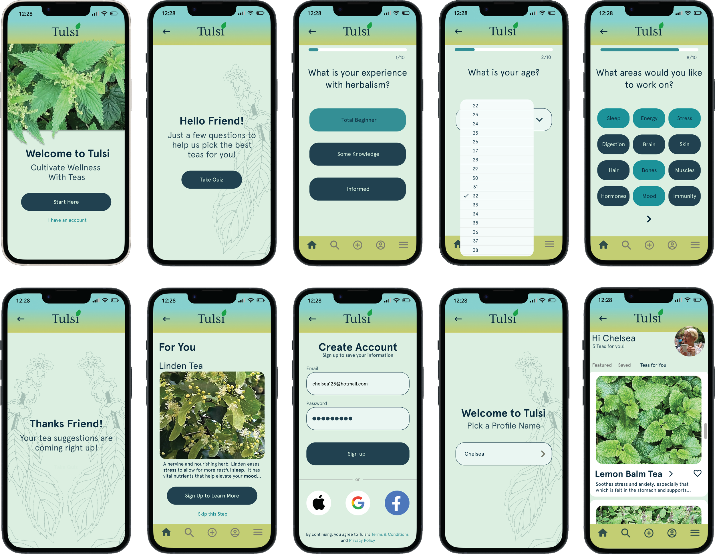
High-Fidelity Prototype:
I continued the testing process in high fidelity, performing 3 rounds of unmoderated tests using platforms like Lookback and Loom.
Reflections & Next Steps:
Designing this app posed a unique challenge because there is really nothing like it in the market, so I skipped steps that would normally be integral to my process like performing a competitive analysis. Analyzing a wide range of wellness apps provided key insights.
Although this started as a “solo” project, the biggest breakthroughs happened when I consulted with my UX mentors, my design colleagues, and my users. Thanks team!
This process acted as a catalyst for several other projects including a wellness membership and live stream course. Stay tuned for future iterations as funding and resources permit.